
PropertyGuru is a leading Southeast Asian online property marketplace. HIVE Design System is created with aims to ensure consistency across the different platforms, improve design efficiency, enhance user experience, support scalability, and reinforce the brand image as a modern tech company in real estate.
I took the role of Senior UI Designer for this project. The goal was to optimize the design system's overall experience and documentation, creating a reference for both designers and developers and aiding in product adoption.
I collaborated with the UI team, which includes: the lead and a fellow UI designer, as well as the core UI engineering team to bring this project to life.
HIVE design system's reception is very positive. It's highly evident on the feedback.
Satisfaction rate
Documentation consistency
Previously, our strategy involved creating every possible variant for easy selection for product designers and showcase all available options. This approach expedited the adoption of HIVE but resulted in several bulky components.
Initially, each component has hidden layers to toggle elements, which, while not as convenient or straightforward as displaying all possibilities, was deemed an acceptable trade-off at that time.


Given that the previous strategy uses a base component with hidden layers, all instances shared the same structure. To address this, the I worked in new branch and created a new instance with all layers visible and then detached it to form a new component.
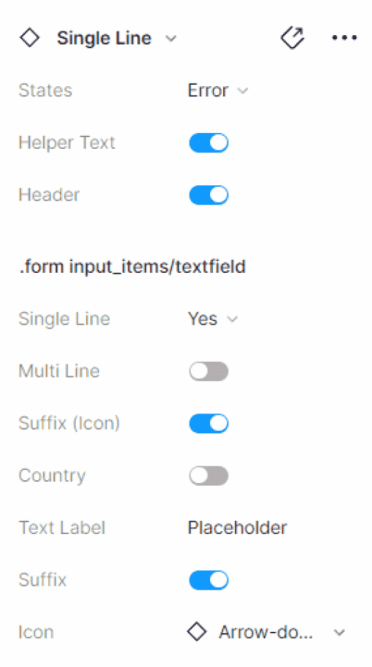
I leveraged component properties extensively. Our fellow designers can effortlessly swap icons and replace text without going through multiple layers. However, two issues quickly became apparent:
The design panel became overwhelming with an excessive number of properties, resulting in a confusing array of toggle switches.
By handing all controls to users, our design system faced a usability challenge: the appropriate use of certain controls became unclear, potentially resulting inconsistencies and complicating the system's use.
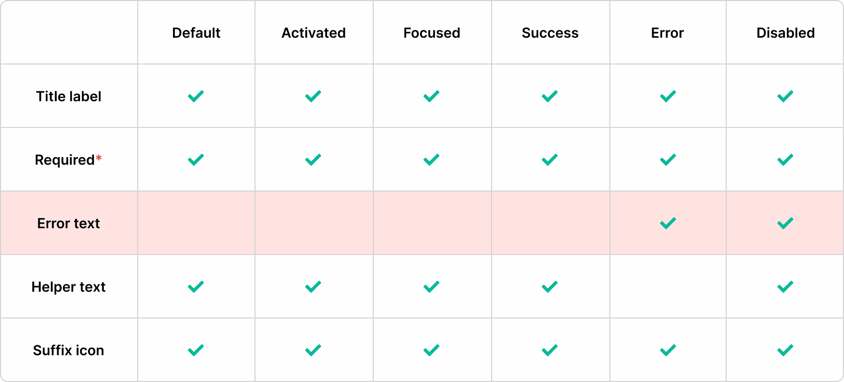
While exposing shared properties such as title label, required*, and suffix icons as component properties, we nested layers like Error Text and Helper Text within specific variants.

For instance, since only the error state variant utilizes the error text layer, we didn't expose it as a component property. Instead, we nested it within the canvas, requiring users to manually access it. This balanced approach allows designers and developers to understand a component's capabilities and limitations while providing usage guidance, with only a minor sacrifice in productivity.
Following this plan, we created 12 component properties and 24 variants for the Text Field component alone.

A significant advantage of the previous Base Component approach was the immediate visibility of all possible options while using the canvas. However, the sheer number of options made the component difficult to maintain.
Aligning Component API with Code
Ongoing Optimization Efforts


I wanted more than just an improved method for organizing properties to increase findability or to resize the design panel. I aimed to find a way to apply these improvements to large, complex components without generating an overwhelming number of properties.

Given that the design panel is not yet resizable, it's better to use short and concise labels for each property. I removed common words like "show," "swap," and "toggle" to avoid cluttering the panel with repetitive labels such as "Toggle On/Off"
Figma branches provided us a peace of mind, ensuring that the production file remained untouched throughout the process. This feature also allowed our team working on the design system to experiment and discuss ideas without risking any unintended changes.
IMPACT
The design system documentation maintains an impressive 4.2 average satisfaction rate. Symbiosis accounts for 50% of traffic compared to Guruland (old DS), based on Google Analytics data. 89% of design work is completed using Symbiosis and HIVE combined.
100% of Universal and Consumer documentation files now adhere to the established framework structure, ensuring consistency across the system.
Symbiosis has undergone over 600 releases, demonstrating continuous improvement and evolution.
Utilized by 19 teams Offers 16 components and 81 properties
Adopted by 36 teams Provides 102 components and 42 styles
Implemented by 16 teams Features 175 components and 16 styles